Divi’s blog out of the box is…well rather lame. It’s not inspiring and it certainly isn’t what I would consider a good Divi Magazine Blog Layout. For those who are looking to take control of their blog and make it pop, I have some great news.
YOU CAN DO IT!
Divi happens to be a great template with amazing flexibility where you can apply CSS code and change the way the template looks and performs.
Below is an example of what I did for Hang Ten SEO’s Blog Layout.

Divi Magazine Blog Layout
Today I would like to show you how to create a Divi Magazine Blog Layout using CSS code. The benefit of a magazine layout is you can section off your posts by categories making it really easy for your readers to quickly get to the stories they want to read. It also showcases your blogs and presents them in a way that is easily digestible.
In oder to create this awesome Divi Magazine Layout you will need the following CSS code and apply it to
Divi Menu Option –> Theme Options –> Custom CSS Section of your Divi Template.
Side Note: In CSS the line containing /* This is a comment */ allows you to add comments in your code. Programmers these days don’t tend to add as many comments to when coding, but from my experience it’s a good practice implement. It makes it much easier to see what is happening.
Copy All the CSS Code Below and add it to the Divi Menu Option –> Theme Options –> Custom CSS Section
/*————————————————*/
/* Divi Magazine Layout Recent Post Customization */
/*————————————————*/
.rpwwt-widget ul {
background: #fff;
box-shadow: 0 1px 3px rgba(0, 0, 0, 0.1)!important;}
.rpwwt-widget ul li {
padding: 0px 8px 0px;}
span.rpwwt-post-title {
font-size: 13px;
font-weight: 700;
line-height: 1px;}
.et_pb_widget_area .rpwwt-widget ul {
line-height: 14px!important;
padding: 10px 0 16px!important;}
.rpwwt-post-date {
font-size: 11px;}
/*————————————————*/
/* Divi Magazine Layout Blog Customization */
/*————————————————*/
/* Categories and Color Settings */
.category1 h3 {color: #4a4683; border-top: 4px solid #4a4683;}
.category2 h3 {color: #79c8cc; border-top: 4px solid #79c8cc;}
.category3 h3 {color: #008bdb; border-top: 4px solid #008bdb;}
/* Title Settings */
.gq-title-row, .gq-title {padding-bottom:0px!important; margin-bottom: 0px!important;}
.gq-title h3 {padding: 10px 5px 15px;}
/* More Button Settings */
.gq-more-button {
margin-right: 25px;
margin-top: 10px;
margin-bottom: 10px!important;}
/* Divi Magazine Two Column Layout */
/* post row */
.gq-double-column-row {
background-color: #fff;
padding-bottom: 0px!important;
padding-top: 0px!important;
padding-right: 10px!important;
padding-left: 10px!important;}
/* Divi Magazine Most Recent Post Column Layout */
.gq-double-column-most-recent { padding-right: 10px;}
/*————————————————*/
/* Divi Magazine More Posts Column Layout */
/*————————————————*/
.gq-double-column-more {margin-top: -30px; margin-bottom: 0px!important;}
.gq-double-column-more .et_pb_post {margin-bottom: 0px; height: 60px;}
.gq-double-column-more a img {width: 100px; height:auto; float: left; left: 0; padding-right: 14px;}
.gq-double-column-more a img:hover {opacity: 0.8;}
.gq-double-column-more h2 {font-size:13px!important; padding-bottom:0px;margin-top:30px!important; font-weight: bold;}
.gq-double-column-more a:hover {text-decoration: underline;}
.gq-double-column-more .post-content {display:none;}
.gq-double-column-more .post-meta {display:block; font-size:12px;}
Divi Magazine Blog Layout Page Formating
Once the CSS code has been added you will need to update the page you’re going to display the blog on. For the Divi Magazine Blog Layout you will need to add the following.
- Specialty Section
- Divider Section
- Text Section
- 2 Blog sections
- 1 Button section
- 1 Sidebar section
When Finished it should look like the setup below. For each category that you want to display in your Magazine Layout, you simply repeat 2 – 5 above.
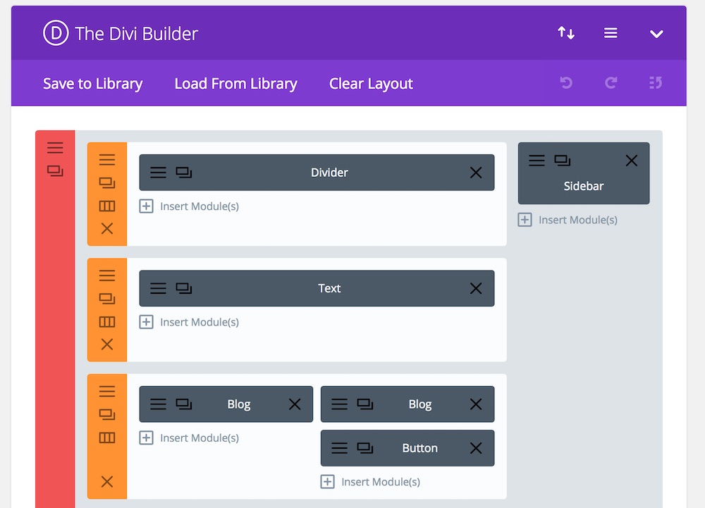
Once you have the layout looking like above you will need to do a few things to get the magazine blog to work correctly, so let’s go over each.
Divider
Mine is set to the following parameters
Advanced Settings
- Divider Weight: 4
- Height: 1
- Color: #0c71c3
Text
For the text section I choose to use “SEO Tips” and text to H2 (Header 2).
First Blog Column
Content
- Post Number: 1
(This represents the first post for the category selected below) - Included Categories: SEO
(I choose “SEO”, yours will be different based on your own website’s categories) - Show Featured Image: YES
Advanced Settings
- CSS Class: gq-double-column-most-recent
(This is utilizing the CSS code we originally added)
Second Blog Column
Content
- Posts Number: 5
- Included Category: SEO
(Same category as first column) - Offset Number: 1
(This is important, by setting the offset number you will not repeat the first blog post in the 2nd column) - Show Featured Image: YES
Advanced Settings
- CSS Class: gq-double-column-more
(This is utilizing the CSS code we originally added)
Button
Content
- Button URL: https://hangtenseo.com/category/seo
(This is where you would add the link for the category you selected)
Advanced Settings
- CSS Class: gq-more-button
Sidebar
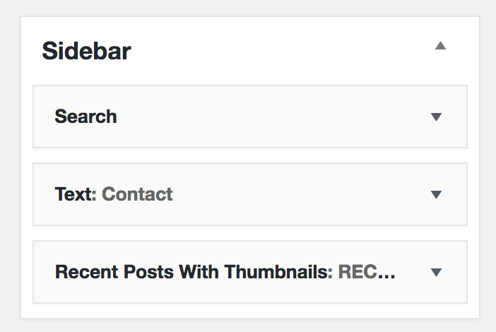
For the Sidebar I used the Sidebar Widget and included the following sections.
- Search
- Text – Hang Ten SEO’s contact information
- Recent Posts With Thumbnails
(Recent Posts with Thumbnails comes from a Plugin with the same name)
Divi Magazine Blog Layout Conclusion
If you want to tweak the Divi Magazine Blog Layout, have at it. This layout works for me and was exactly how I wanted the blog to function. I have tested the blog out on mobile and it works great.
Let me know how it works out for you.

